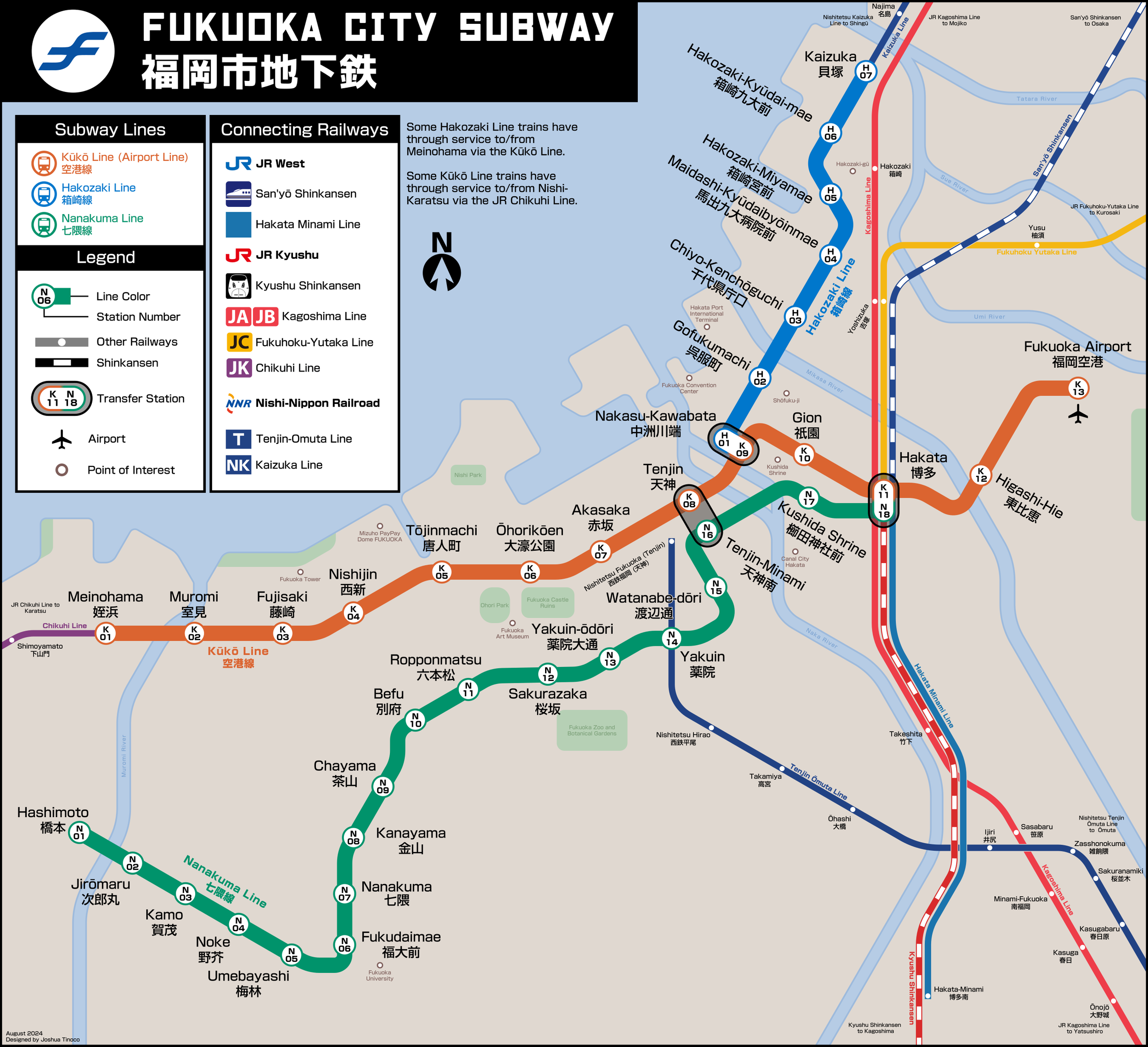
A map depicting Fukuoka's Subway system and other railways.

Map of a hypothetical Detroit subway.

A diagram for a proposed Cleveland Commuter Rail network.

Map of an expanded Chicago L system

A map for a proposed Cleveland Subway Network

A map for a proposed Cleveland Commuter Rail network.
While I’ve spent time making hypothetical transit maps of US cities, I wanted to create a transit map based on a fictional city. It’s much easier to design a map for a real city when you’ve have references to use, but creating a map of a city that does not exist takes a lot thought and experimentation. For this project, I came up with a network of lines, names, and gave it an identity that feels real. I came up with a map and signage for a city dubbed “Neon City.” I envisioned this city to be this cyberpunk, futuristic city with flashy neon lights, and a mix of Art Deco and Neo-futurism. I wanted the logo to have a recognizable symbol that people could identify and know that’s a subway entrance. The logo uses a yellow lightning bolt with a white circle, over a purple background. Many transit agencies around the world tend to use abbreviations for their names such as the MTA (Metropolitan Transportation Authority), WMATA (Washington Metropolitan Area Transit Authority), or MRT (Mass Rapid Transit), so i wanted to do this as well. In the logo, NCT stands for “Neon City Transit.” Initially, the name was Neon City Subway Transit, but when you abbreviate it to NCST, it’s a lot, but also, if you read it, you might hear a word you probably don’t want to hear people calling your transit system. The yellow over purple really pops and the additional circle gives the logo a sense of motion.


The emblems for the network’s lines use a hexagon with a letter at the center. The letter corresponds to the name of each line, for example, The Vapor Line is labeled as Line V. This was done to also allow for station numbering which is a common practice in countries like Japan. In fact, the network map and the signage (left) reflect ideas used in metros like Tokyo and Osaka. The topology of the subway system does not focus in on a central business district like the Chicago L or MARTA does. Instead, the network has lines going all over the place and feels reminiscent to how chaotic the Tokyo Metro map looks.
The signage, or wayfinding is heavily inspired by signage used by the Tokyo Metro and JR East. Although I did not include station numbering on the map, the signage uses it sporadically. I believe the emblems should only include the station number at entrances, and at the platform level. This information would be unnecessary on signage when you’re already within the station walking through concourses and mezzanines. It becomes more important to locate where the lines are within the station, the platform to stand at, and other features like elevators, information desks, ticketing machines, coin lockers, and more. For exit signs, yellow with black text is used to make it easy to identify. The other signs use black on white or white on black as a way to see which one has better contrast. I think this would be purely based on where the signage is placed and the lighting in the area.
Lastly, the strip map is an important sign to have to make it easy for people to follow the line they’re taking while removing all the extra information the map contains. The strip map I designed shows all the stations with their names, numbers, and if they include transfers to the other lines. I’ve also made sure to emphasize the station this strip map would be located at.